Twins Development
Construction Company Visual Identity
Industry
Real Estate
Services
Brand Identity
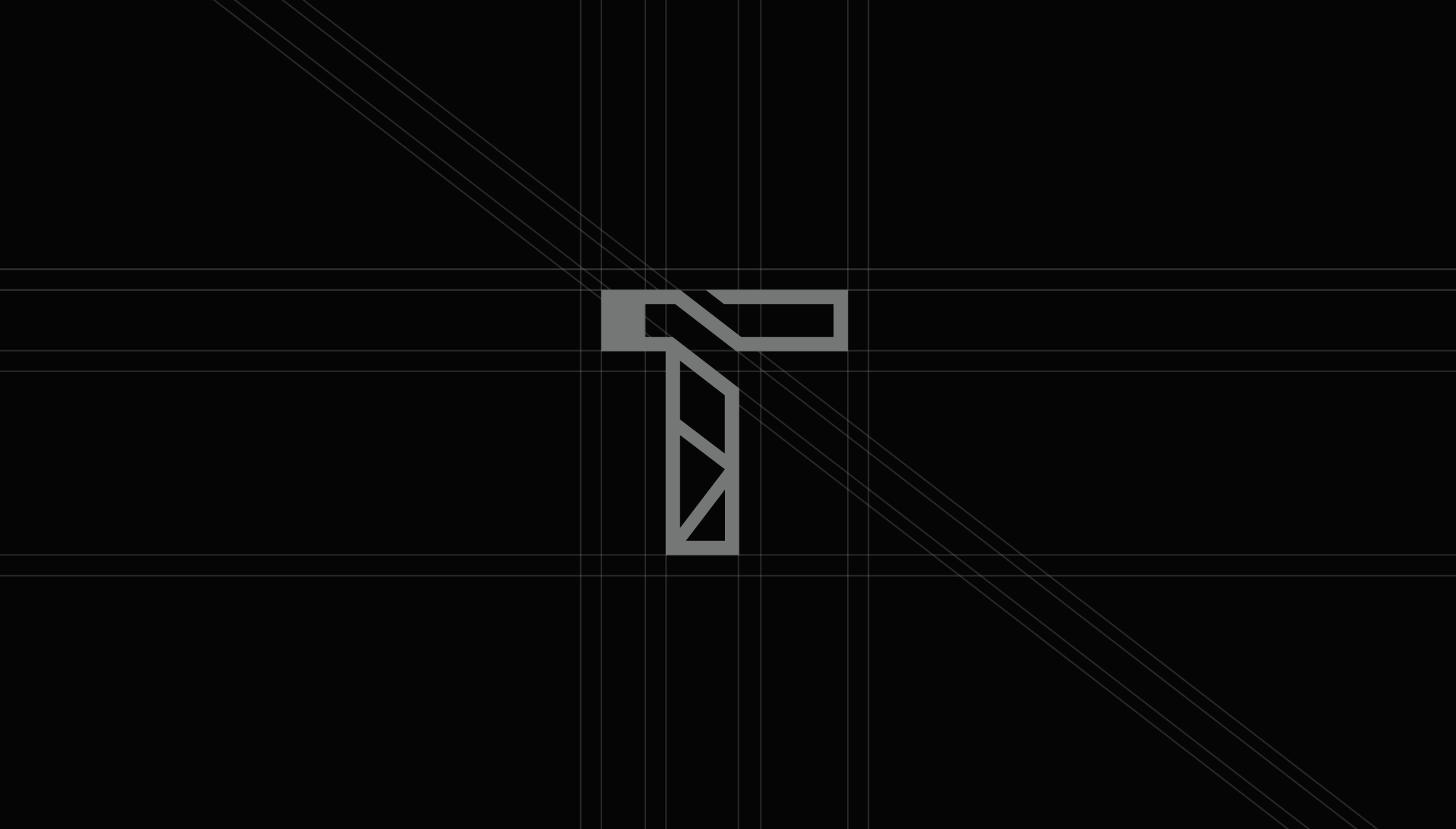
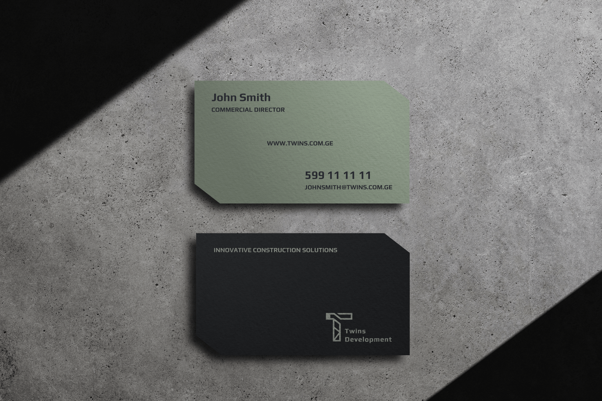
Logo Design
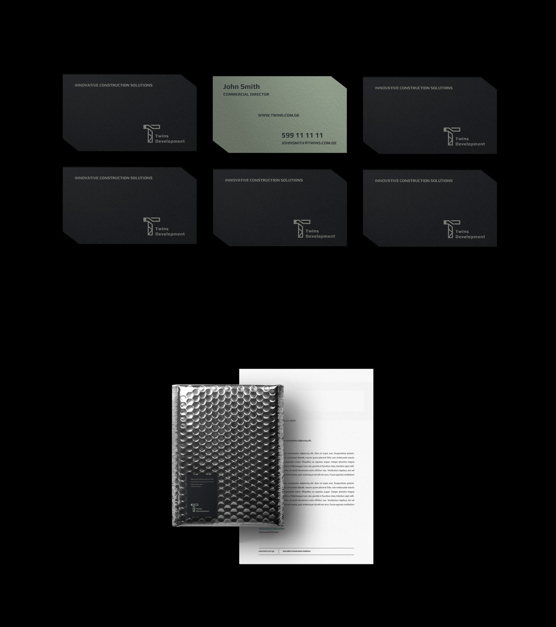
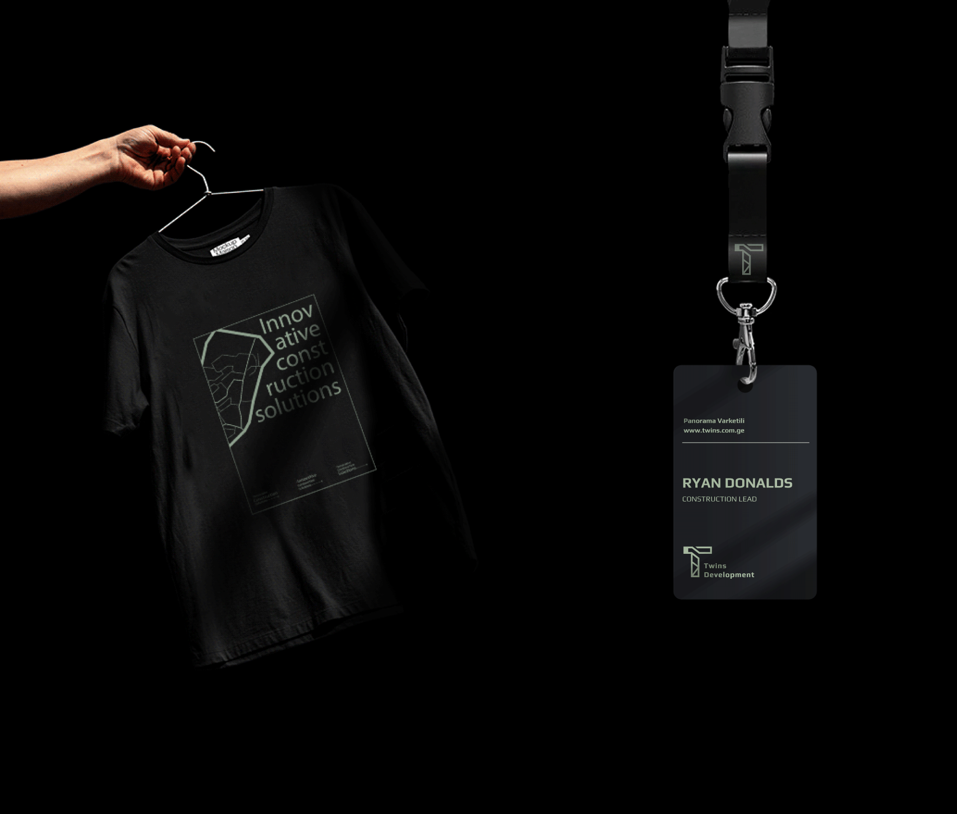
Merch
Website Design
Brief
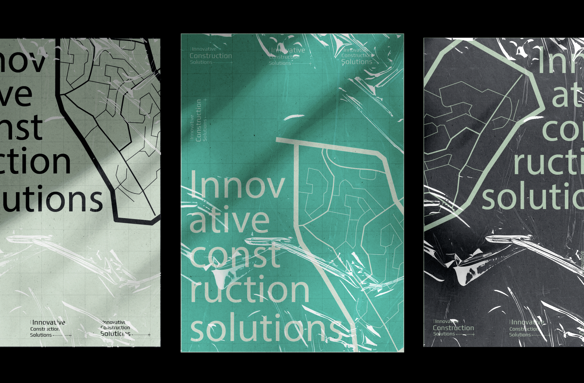
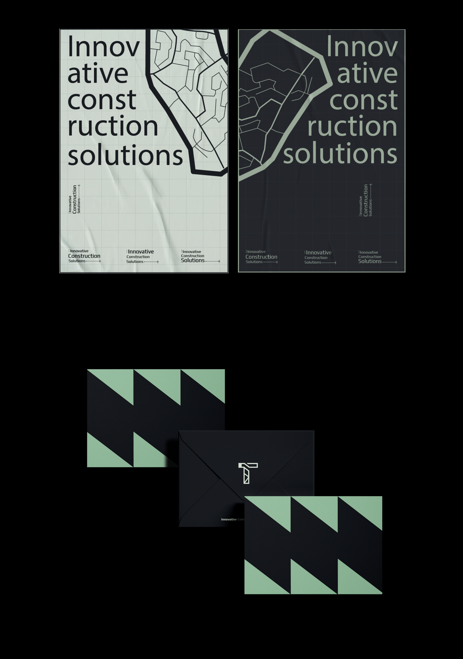
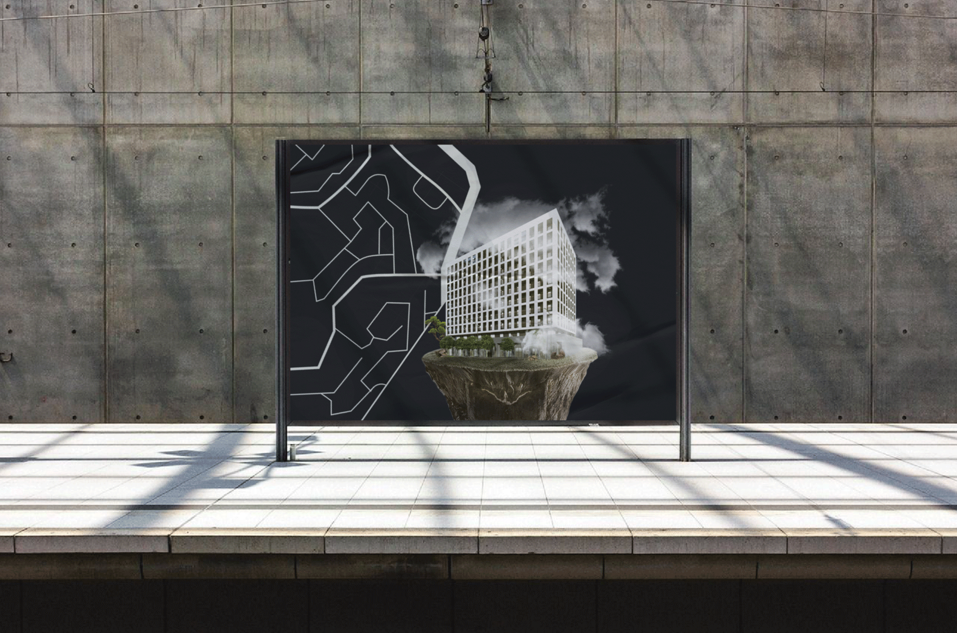
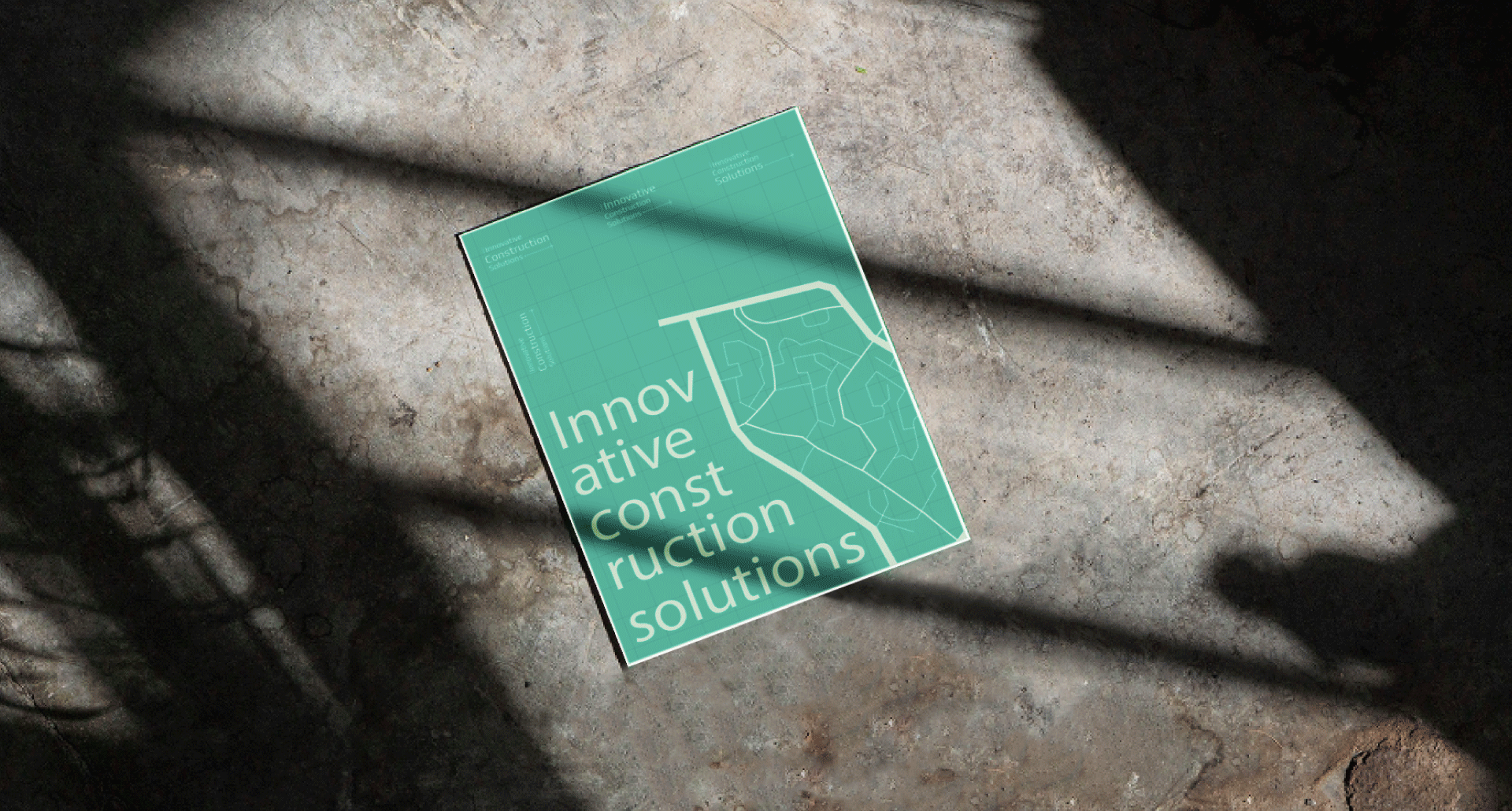
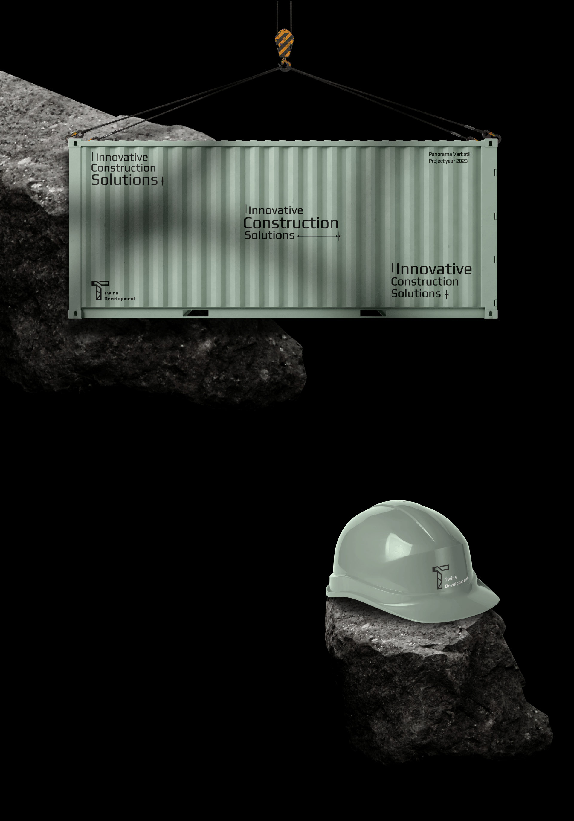
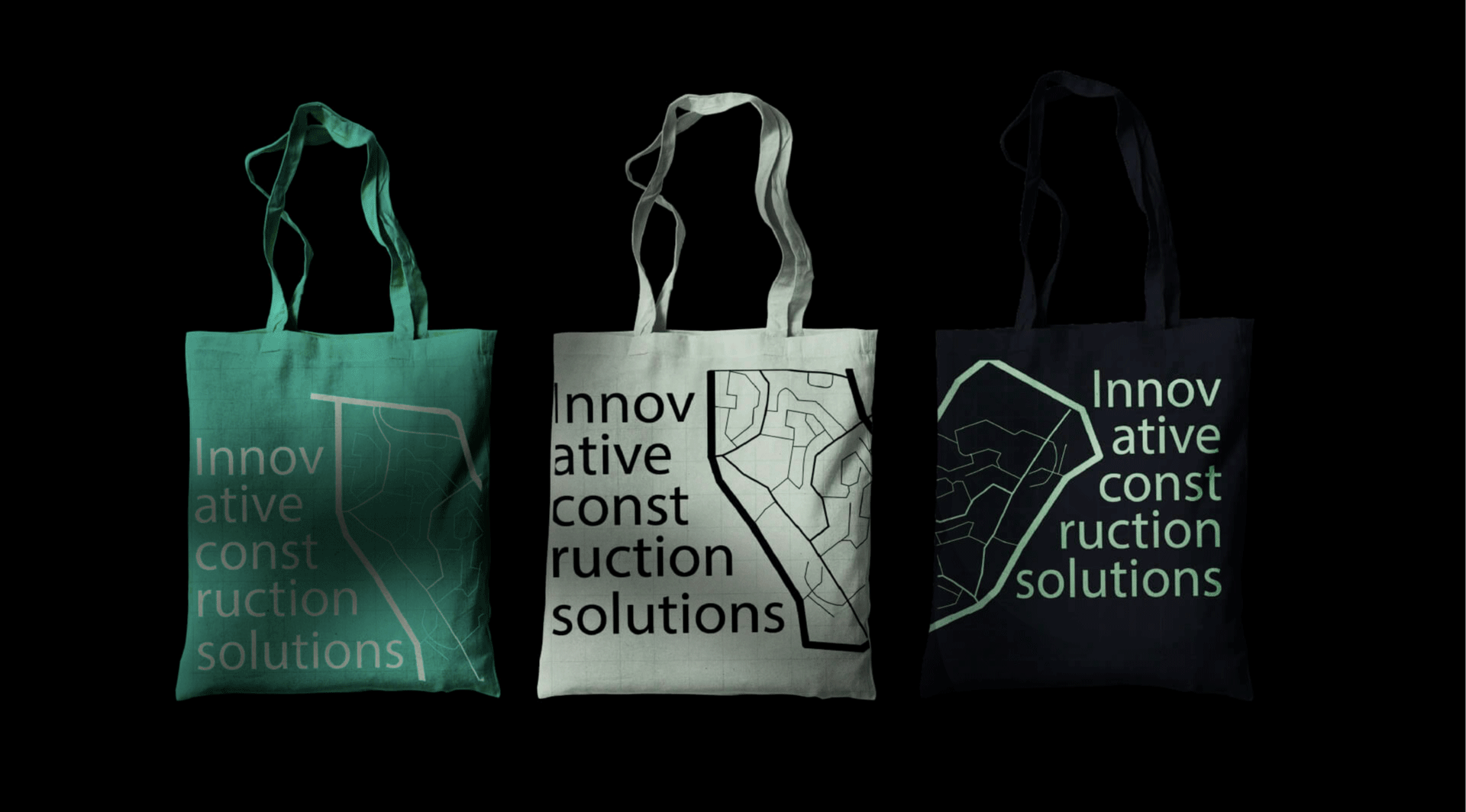
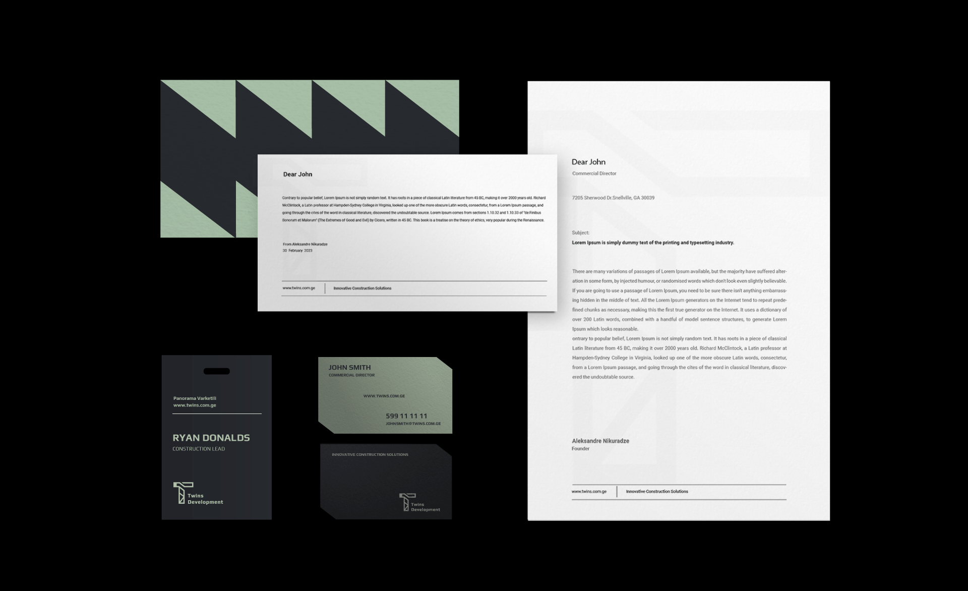
Twins Development is a construction company based in Tbilisi, Georgia. Its project Panorama Varketili is located in an area with stunning views of Tbilisi and the Tbilisi Sea. The client’s vision was to incorporate the iconic tower crane into their branding and opt for the color green. The client wanted a full visual identity to use as a guide for billboard posters and social media post visuals.
Approach. Outcome
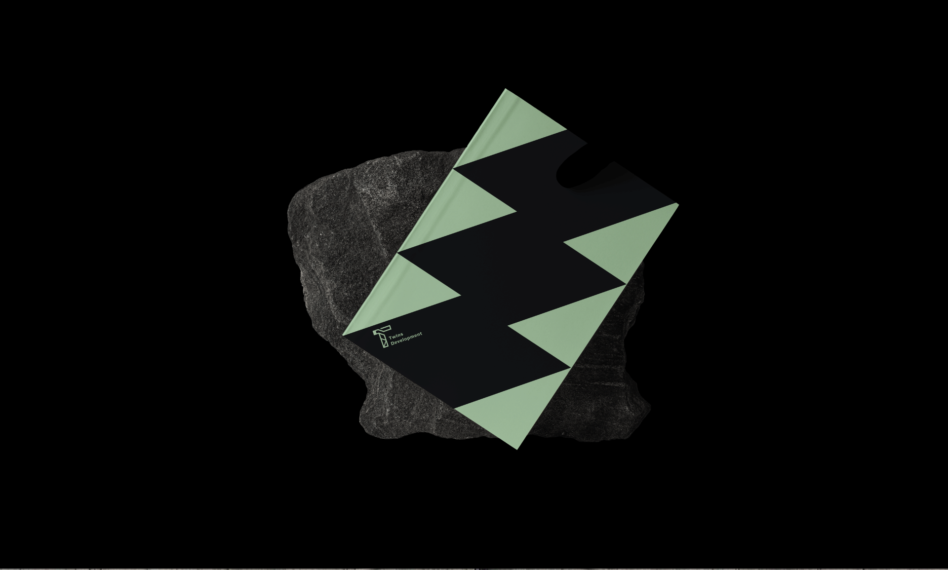
I was delighted that my client had a clear vision for the logo, which made the logo design process proceed smoothly. After thoughtful deliberation, I decided to leverage the letter T from the company name as the foundation of our design. The result is a contemporary and streamlined logo that aptly embodies the essence of Twins Development. By skillfully integrating the letter T with the tower crane, we achieved a robust and memorable visual symbol. The challenge arose when it came to selecting the visual elements for the posters and creating a cohesive design language for the company. I explored various ideas, including doodle drawings of the building, tower cranes, and apartment blueprints. However, I ultimately gravitated toward the concept of incorporating map elements that represent the actual location of the building. Additionally, I incorporated a design element from the logo, which I repurposed for the stationary merch. Overall, the client expressed satisfaction with the final design, and I, too, was pleased with the outcome.