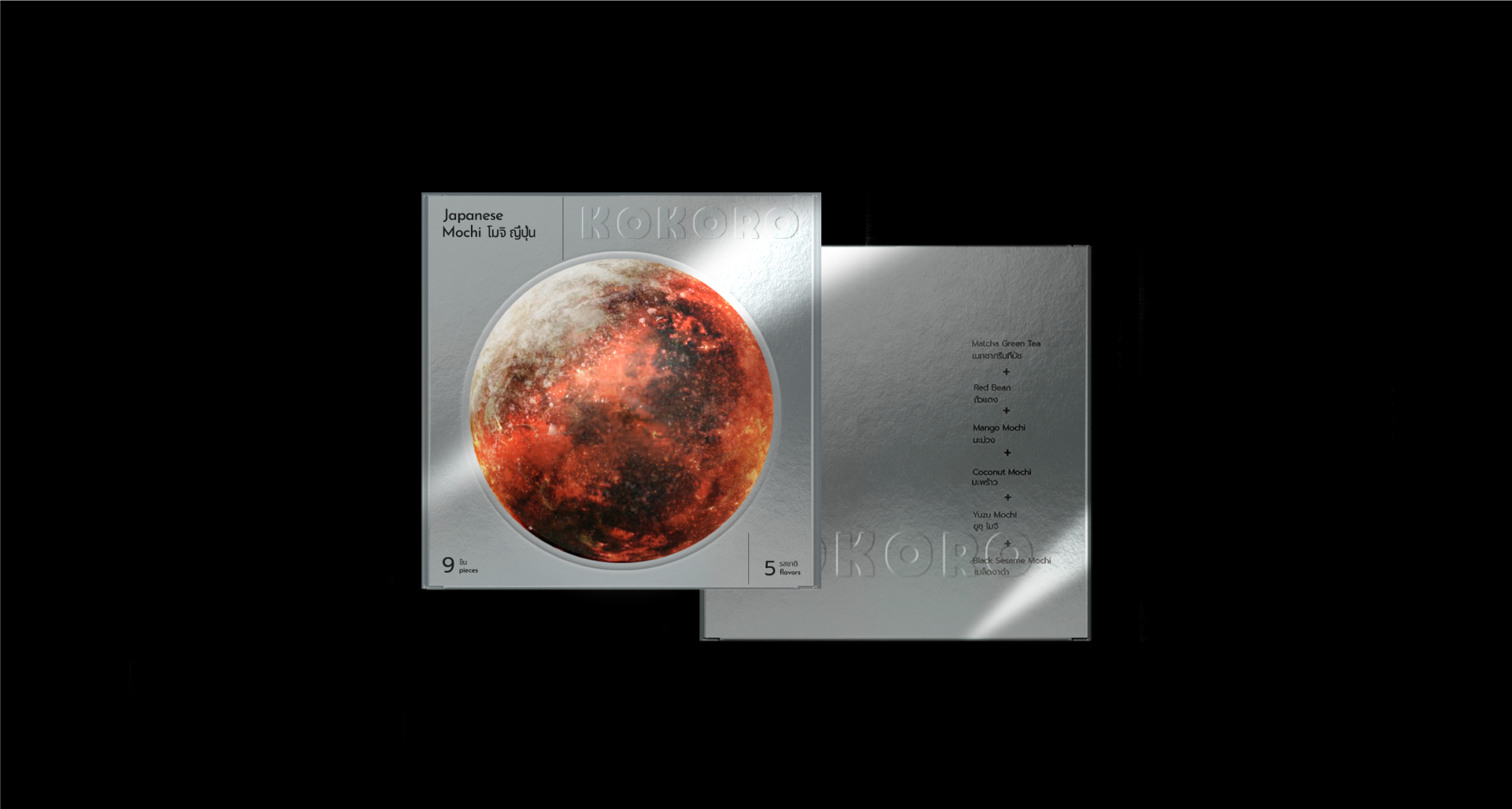
Kokoro
Japanese Mochi Visual Identity
Industry
Restaurant/Food
Services
Packaging Design
Brief
I met Yusuke, a young and inquisitive Japanese man during my travels in Thailand. Yusuke expressed a strong interest in sharing Japanese culture with other societies. Proficient in crafting Mochi he was eager to establish a business in the dynamic city of Bangkok. I offered Yusuke to develop a distinctive visual identity for his upcoming brand. Yusuke wanted the packaging to say "Hey, this box is from Japan".
Approach. Outcome
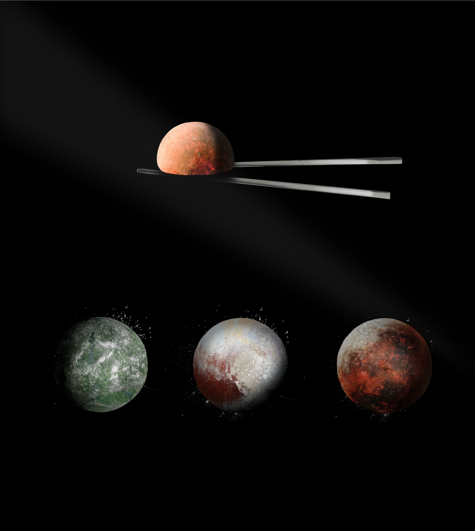
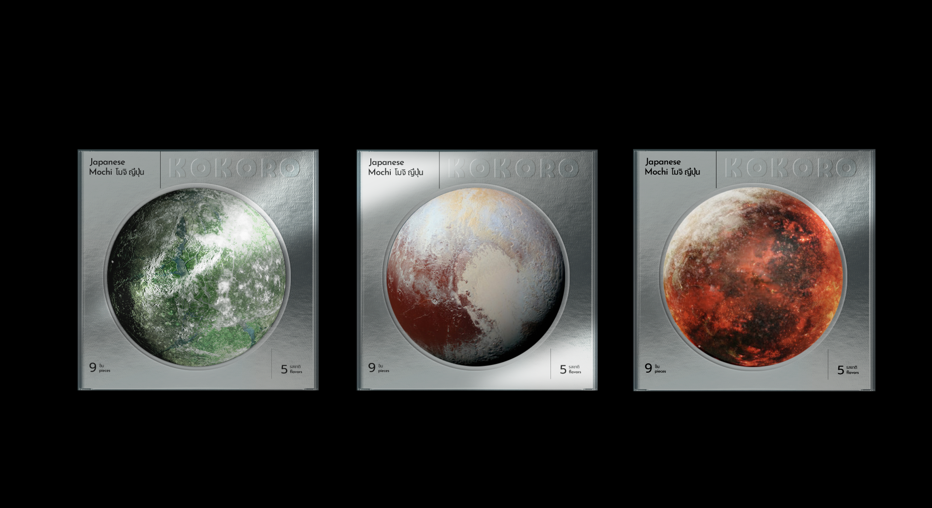
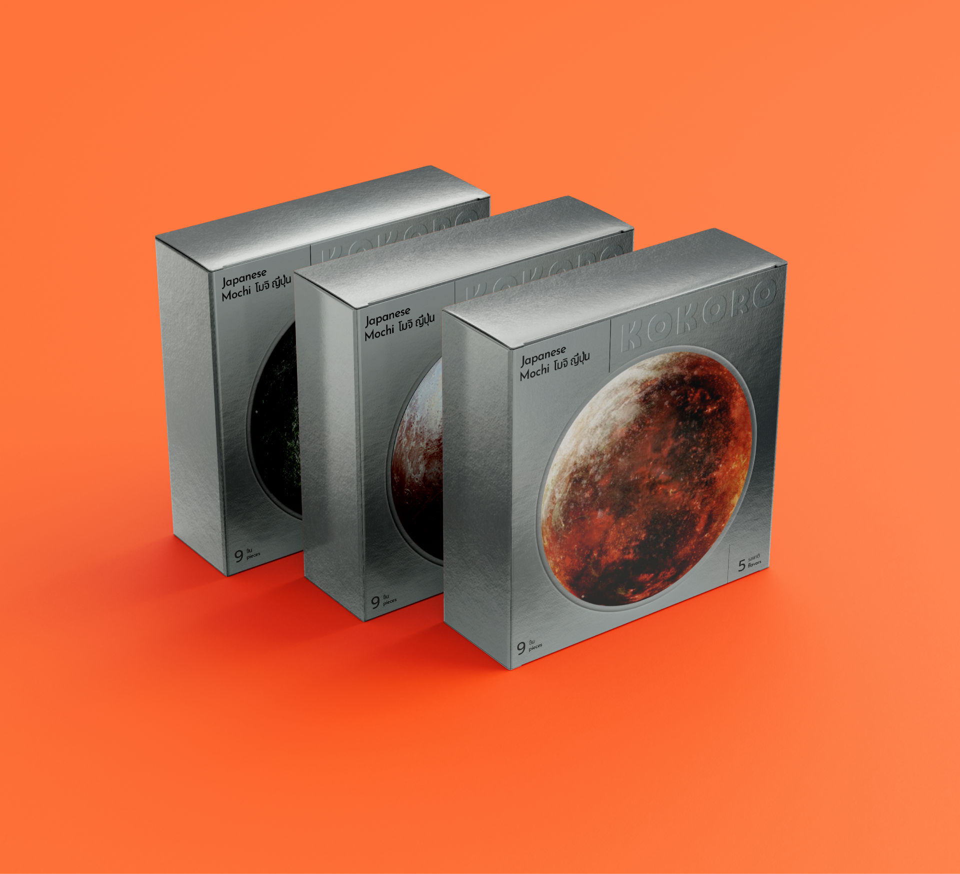
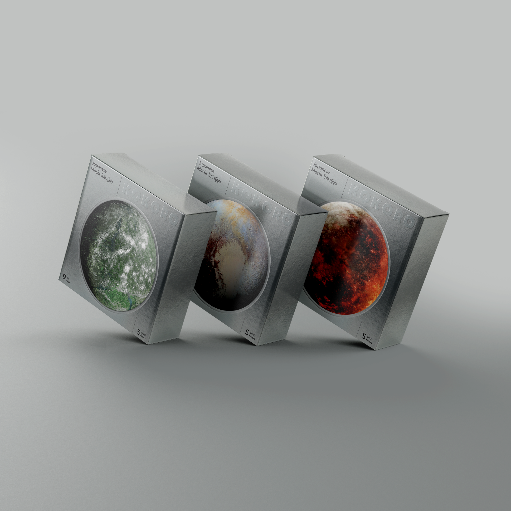
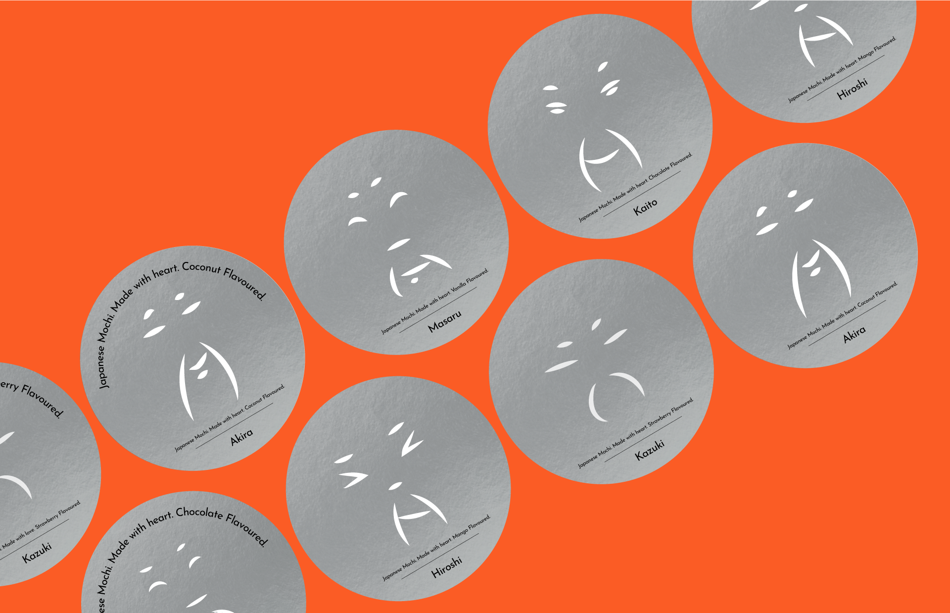
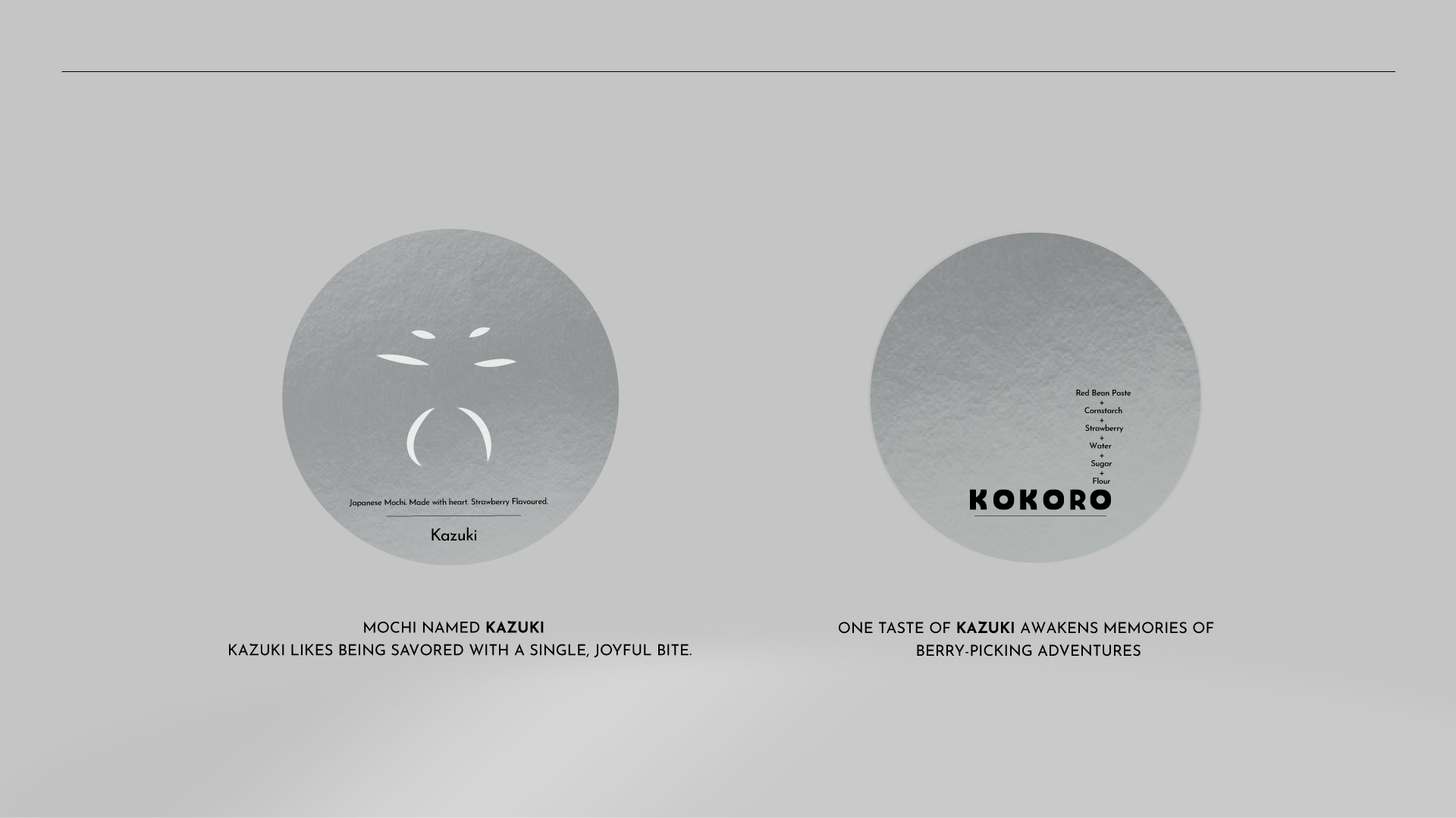
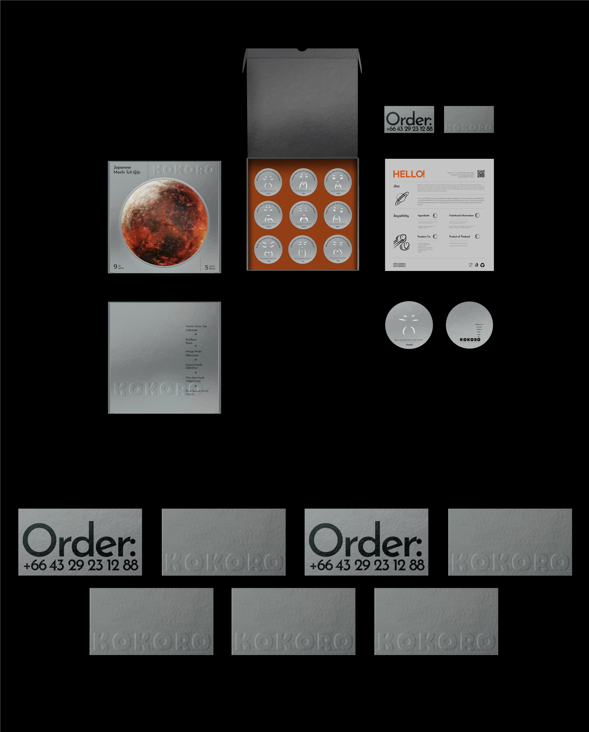
Asian visual aesthetics embrace a minimalist ethos, highlighting simplicity, harmony, and the removal of extraneous elements. This philosophy finds its roots in traditional Eastern ideologies like Buddhism and Taoism, which underscore the allure of beauty and significance in simplicity. The practice of overlapping elements, such as fonts or shapes, in Asian design finds its anchor in the concept of layering and depth. Unlike a strict reliance on linear organization or sharp element divisions, Asian design invites more organic arrangements, where objects coalesce and engage. This imbues the composition with a sense of dynamism and intricate complexity, all concealed within a veneer of seeming simplicity. In this context, imagine the texture and form of mochi – it effortlessly mirrors the graceful contours of planets, while a gentle dusting of flour encapsulates the essence of cosmic particles. For a distinctive brand touch, I took pencil to paper and brought forth a gallery of diverse Japanese male visages. These captivating countenances were thoughtfully matched with specific mochi, birthing a charming fusion of artistic expression and culinary craftsmanship. This artistic stroke not only bestowed each mochi with its own unique persona but also bestowed them with names that harmonized with their individual identities.